Mental Health Mobile App
Overview
YourMood is a mood-tracking project, my teammate Kishan and I started from scratch. I was in charge of design, Kishan was in charge of the programming. Together, we both thought of the features and strategy.
Overview
YourMood is a mood-tracking project, my teammate Kishan and I started from scratch. I was in charge of design, Kishan was in charge of the programming. Together, we both thought of the features and strategy.
 Results
From idea to conception, Kishan and I were able to bring YourMood to life in January 2025. This fun 4-month pivot from whiteboard to mental health's app resulted in top 5 score in my Master Course.
Designing the end-to-end experience for mobile app.
Interviewing users, user testing.
Defining feature.
Take the usability test
Your Mood started out as a collaborative brainstorming whiteboard that reduced the stress to increase the mental health. However, I found myself using it a lot more for trip planning than brainstorming, so Kishan and I decided to pivot and scope it towards planning.
 The Problem
- Mental health problems have 39% increased since 2018-19. Includes over 1 million children, with 16-year-olds most likely to seek support.
- The mental health app market is growing at an average annual rate of approximately 17.12% per year in the UK (From $2.1 billion to $10.2 billion in 7 years)
- 1 in 9 adults feel stressed every day.
 The Solution
- To create an application that helps build & track mood
- Encourage / motivate users to take action
- Create awareness about unhealthy lifestlyle
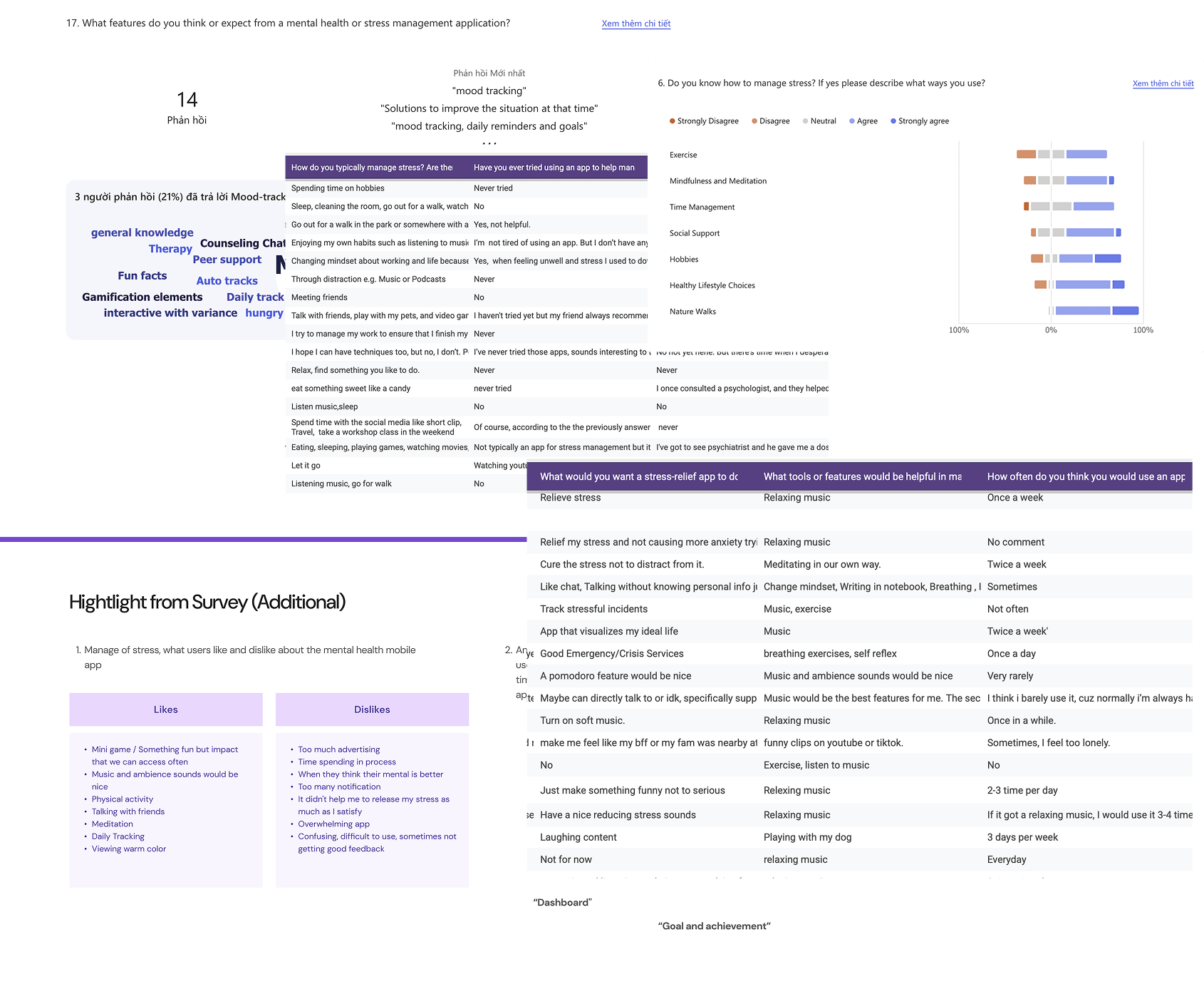
Interviews & Surveys
Using the open-ended answers in our surveys. Once I was done conducting the quantitative research, I knew that the theme was very personal. Thus I decided to conduct user interviews with specific people through Teams.
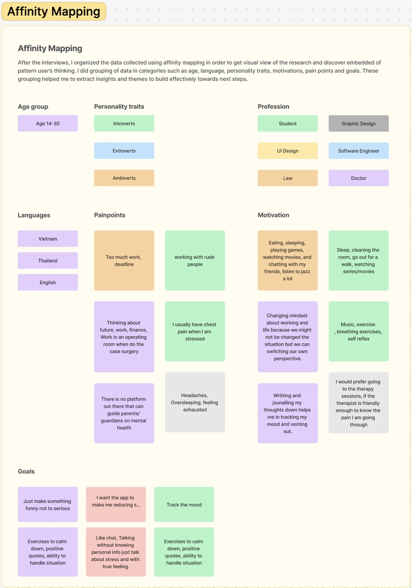
Affinity Mapping
=> After the interviews, I organized the data collected using affinity mapping in order to get a a visual view of the research and discover embedded patterns of user thinking. I grouped the data into categories such as age, language, personality traits, motivations, pain points, and goals. These groupings helped me to extract insights and themes to build effectively toward the next steps.
 Key Ideas
- Just make something funny not too serious
- Exercises to calm down, positive quotes, ability to handle situations.
- Track the mood.
- Like chat, Talking without knowing personal info just talk about stress and with true feeling.
- I want the app to help me reduce stress.
Competitive Analysis
I test many of our competitors’ products, such as Headspace, DailyBeans, MoodShift, etc. I created a a chart where I wrote down everything I liked and disliked about each product—and things Your Mood could do better.
DailyBeans’s user interface has too many options, overwhelming potential new users.
Almost feature is premium so users were confused about what they needed to buy or not.
Defining features
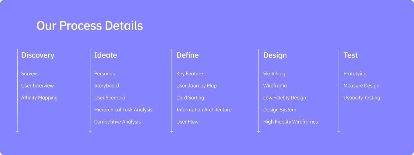
When I finished grouping all the thoughts and notes from the interview, my next step was to view the user’s planning at a high-level journey and figure out the jobs to be done at each step of the way. These steps consisted of → Brainstorming → Planning → Execution. I was able to then narrow down the users’ goals and pain points and shape them into implementable features.
Quantitative data + Qualitative data = Key features
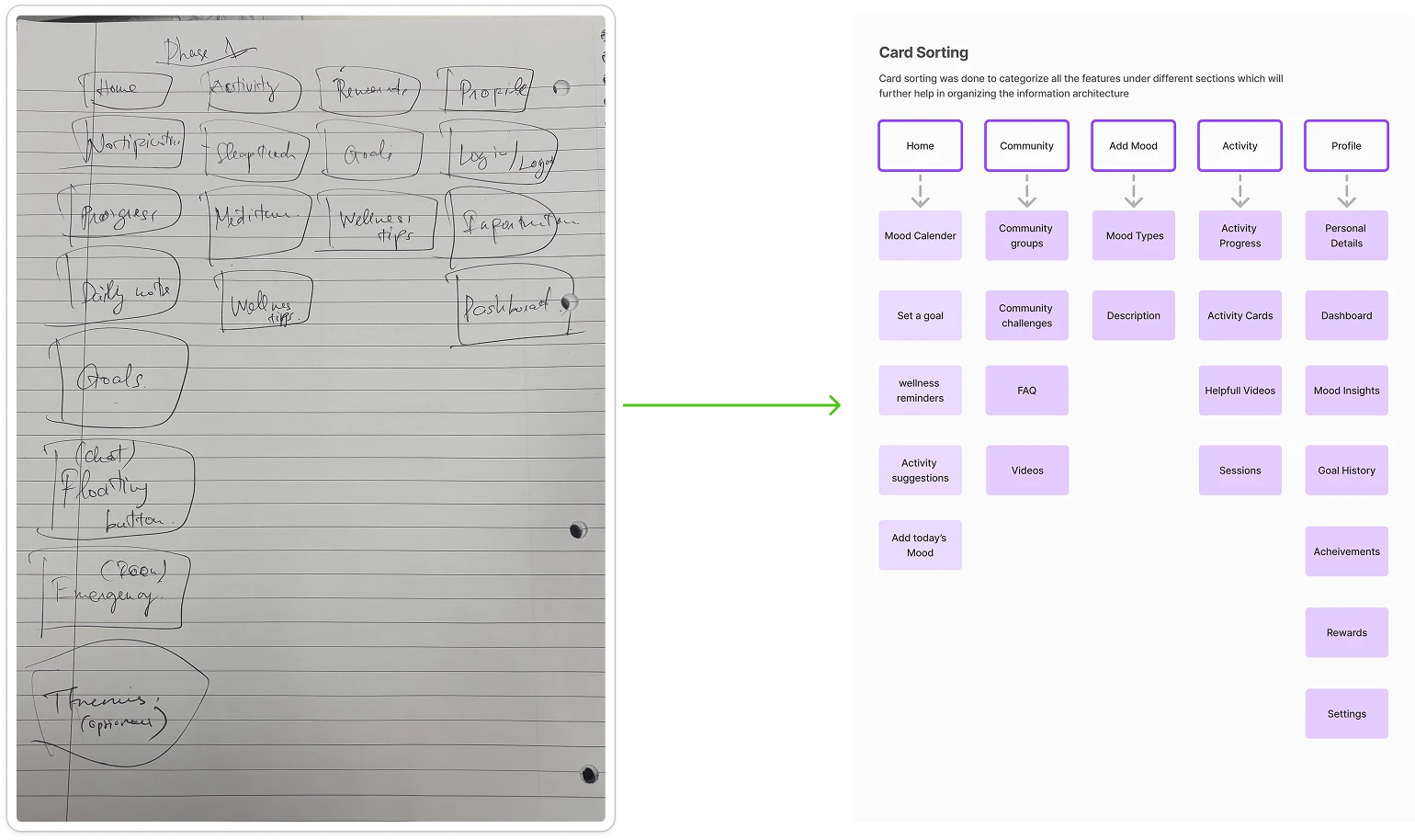
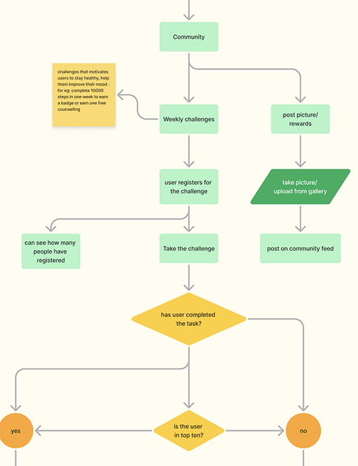
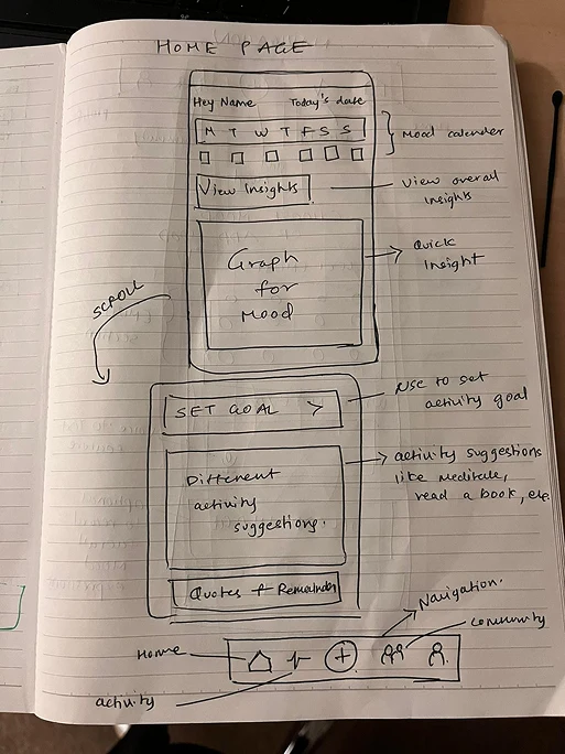
Early User flows, sketching, and wireframes
Before I started designing, I began mapping out interaction flows of different parts of the user journey. Below are images of the ‘Getting Started’ flow. The main goal was to get the user started planning as soon as possible with the smallest amount of friction.
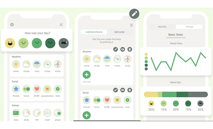
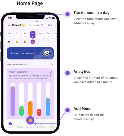
High fidelity mocks
While creating these mocks, Kishan and I met on a regular cadence, (about 4 times a week) to review and get feedback. This would ensure the mocks would go through many rounds of iterations until we landed on something we were both satisfied with.
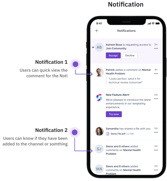
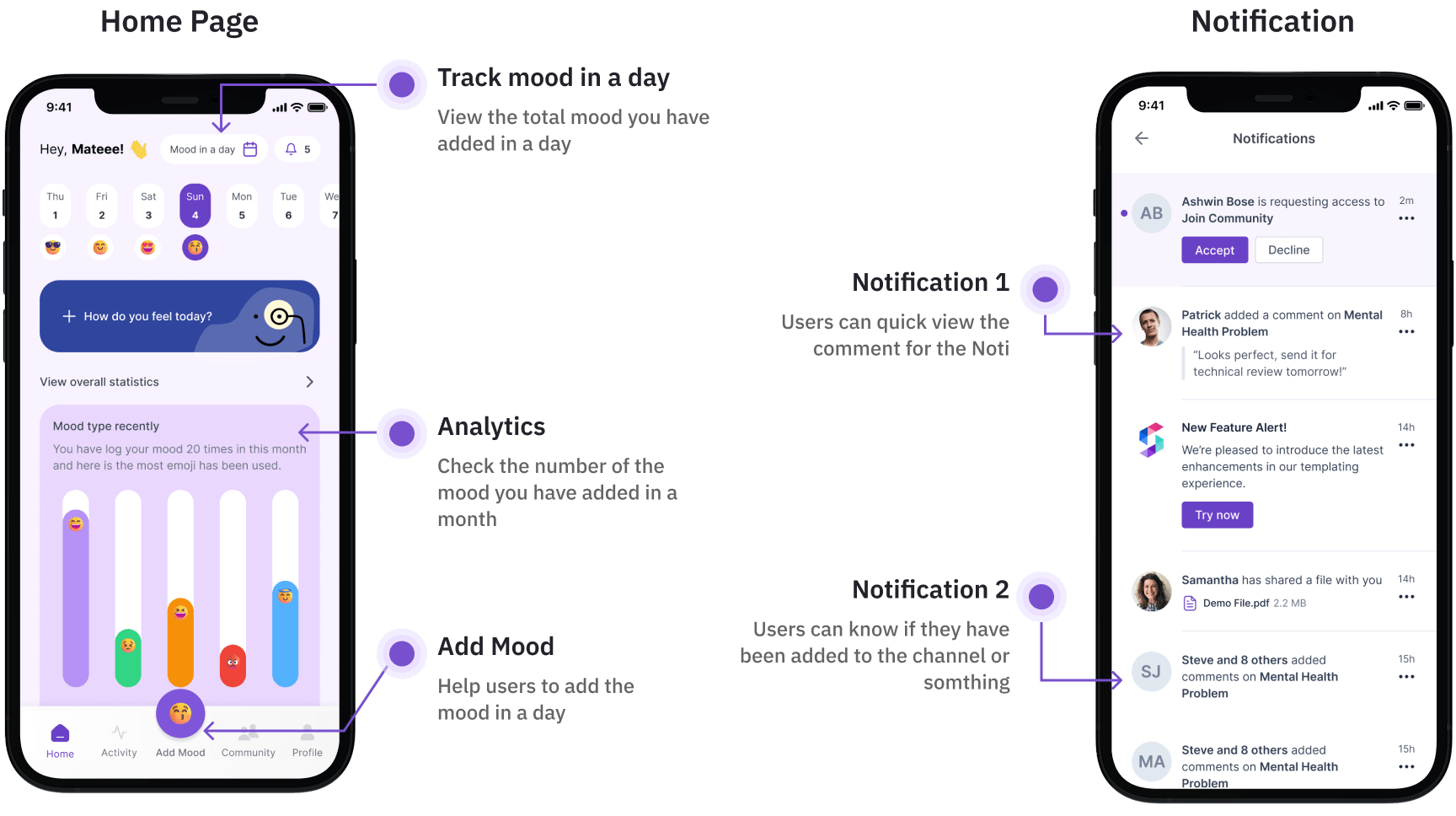

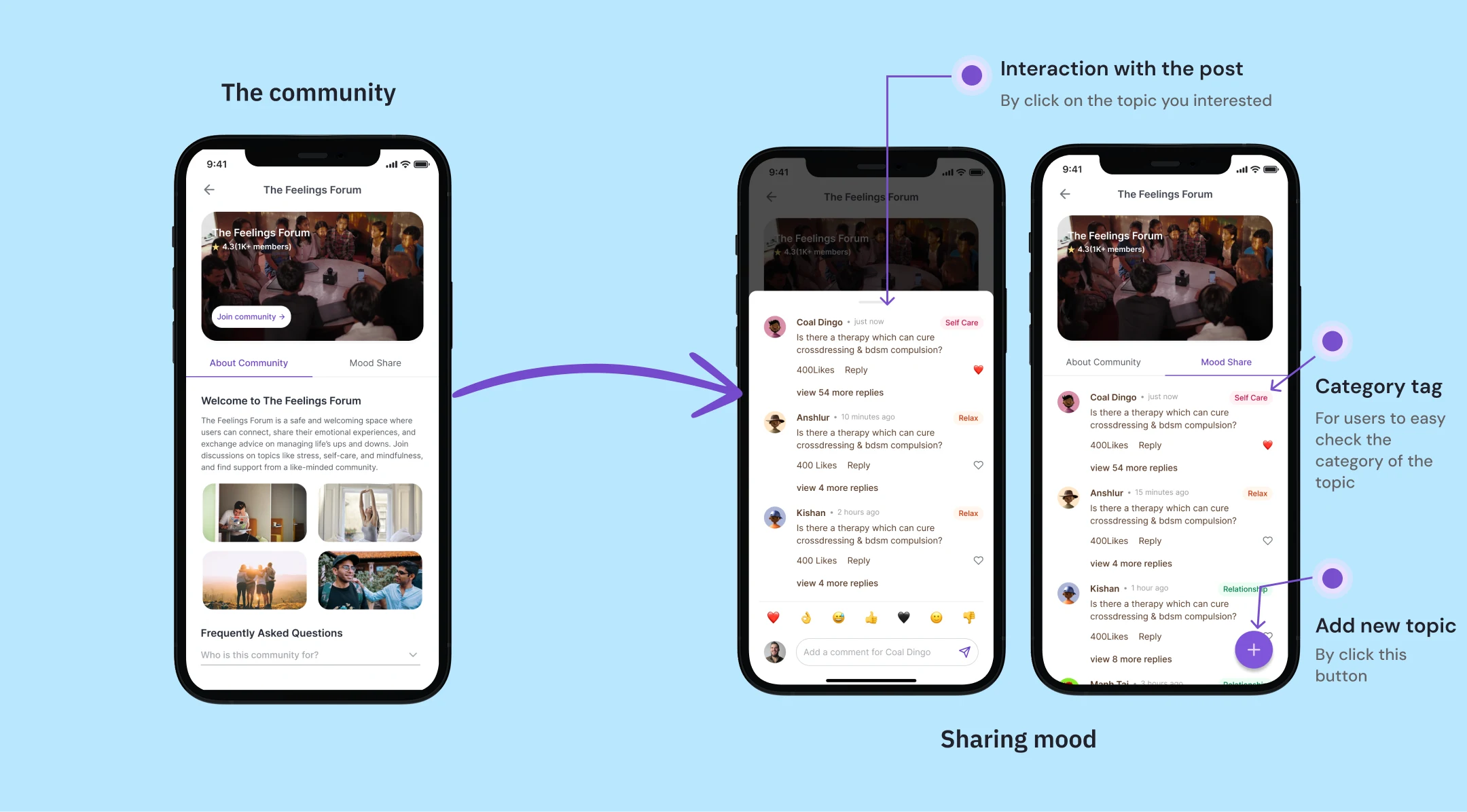
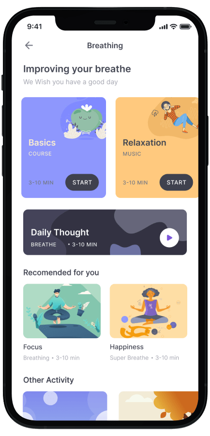
This screen shows when users click on Meditation on Activity Feature
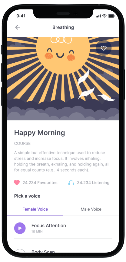
It can be music or a tutorial for users to meditate
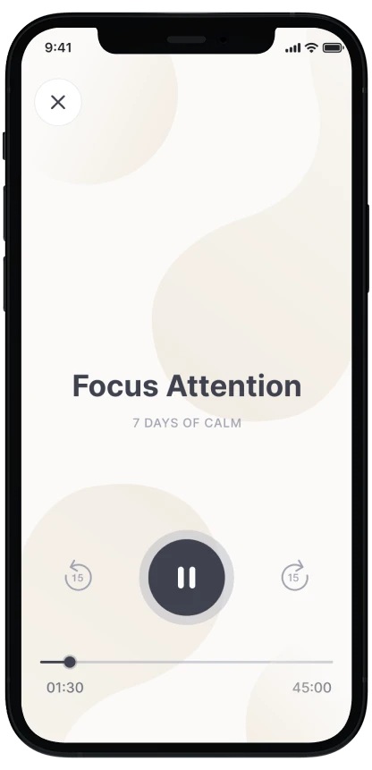
It can be music or a tutorial for users to meditate
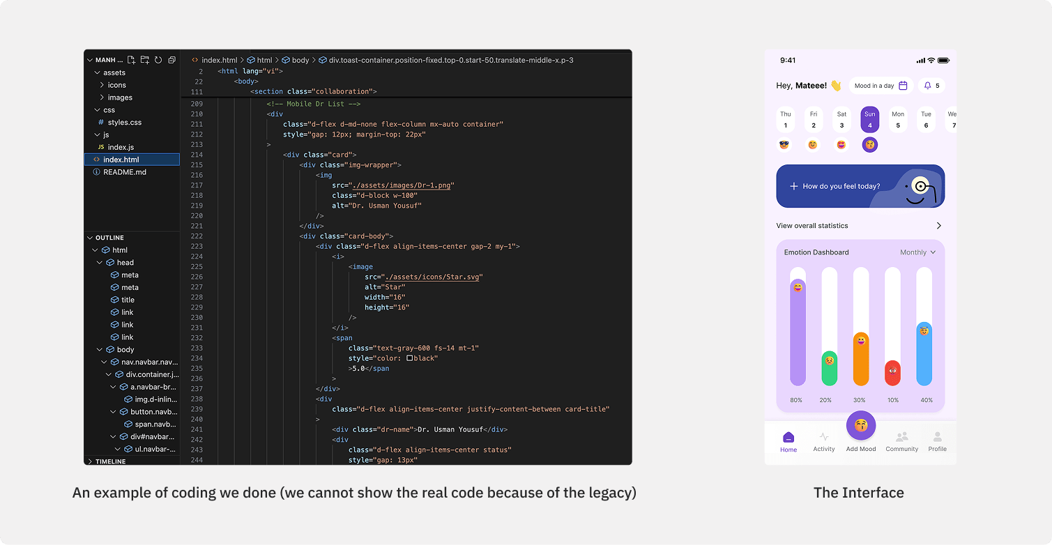
Designing and coding for the app
Making sure both designer and developer were consistent in terms of design was tricky. The the difference in interactions and the way users would access each function was even trickier. Here’s an example of how we develop the idea from design
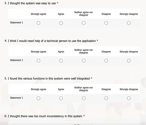
Take the usability test
To validate the designed solution, I conducted usability testing. This testing aimed to assess the the convenience of the current flow, comprehensibility of the provided copy, and areas that require enhancement for better user interaction. The participant criteria I tested remained the same as in previous studies, specifically, individuals who had prior experience with counseling services and those who were seeking counseling for the first time. Usability testing was conducted using Maze as a prototype and Zoom for communication.
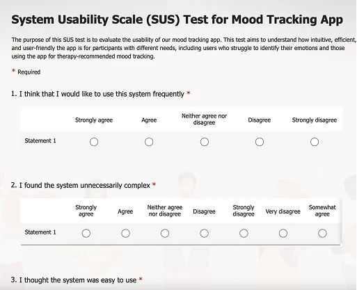
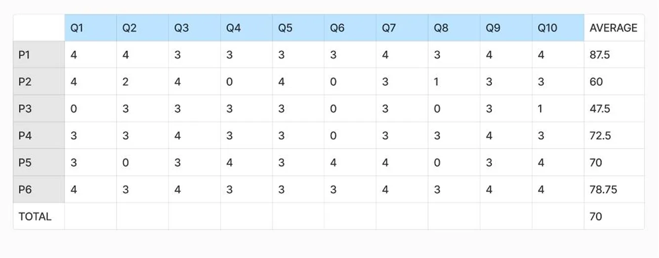
Usability (SUS) Test Results Analysis
Results gathered from 6 test participants show an average SUS Score of 70. The above-average (at the 50th percentile) is 68. That means a raw SUS above 68 is above average and below 68 is below average.
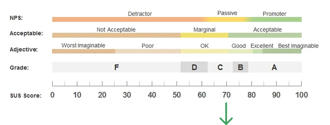
A SUS of 70 is at the 78th percentile (scoring better than 65% of the scores in the database). A raw SUS of 52 fails at the 20th percentile (scoring worse than 85% of the scores in the database).
User Interview Test
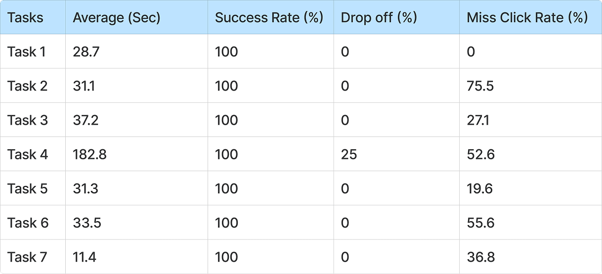
We use the Maze test website to create 7 actions for users to do in the app and here is what I found:

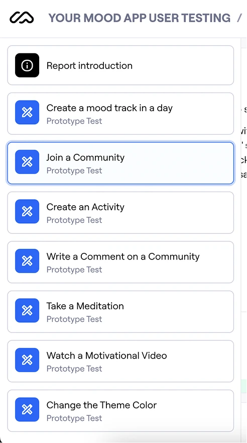
Result:
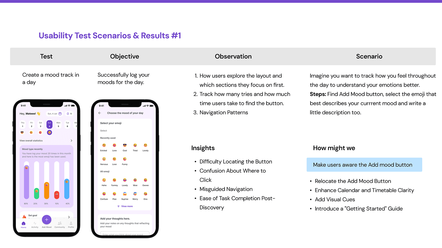
Usability Test Scenarios & Results #1
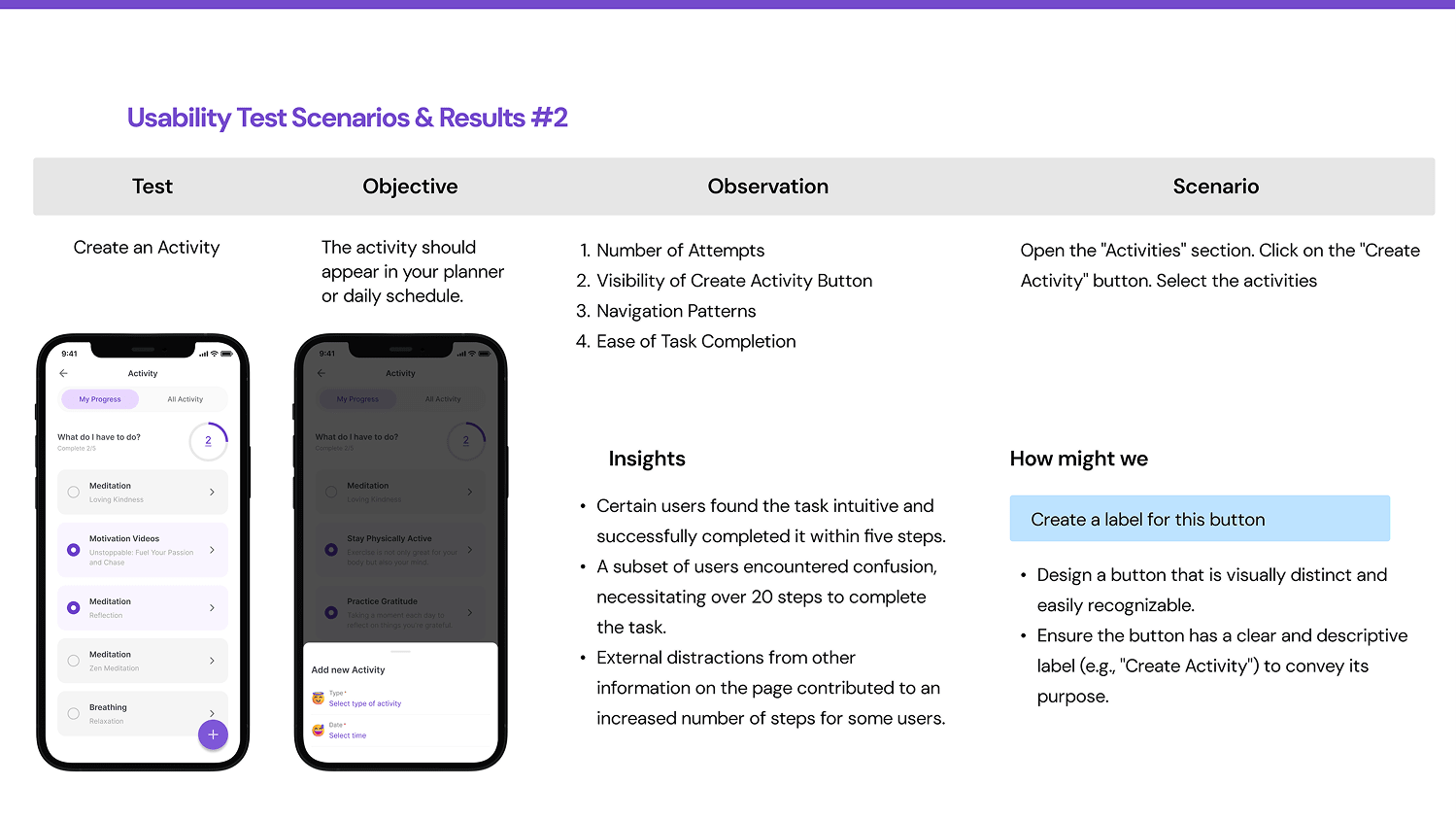
Usability Test Scenarios & Results #2

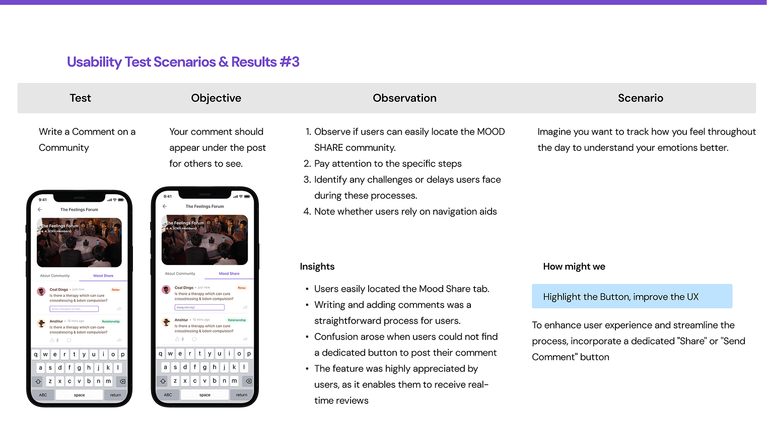
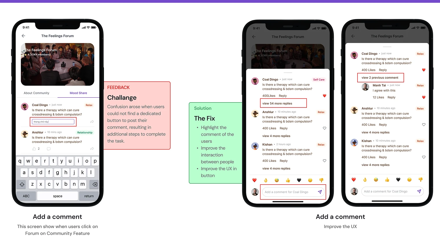
Usability Test Scenarios & Results #3